Navigation and Search
Four ways to move around the system fast: a role-aware sidebar, clickable breadcrumbs, a back button that returns you to where you were, and a ⌘E command palette that jumps to any record or screen.
- A sidebar that matches your role
A sales rep sees Orders, Quotes, and Customers, not warehouse or production screens. Less clutter, less confusion, faster onboarding.
- Breadcrumbs you can click
Every page shows the full path with every level clickable. Jump back to any parent in a single click without losing your place.
- Command palette jumps anywhere
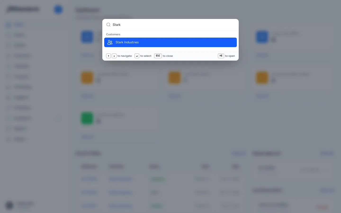
Hit ⌘E, type a customer, SKU, or order number. Results span every entity in the system and you're there in two keystrokes.
- A back button that remembers
Returns to the previous screen inside the app, simpler than the browser back button because it always lands in the right place.
What it does
Provides four ways to move around the system quickly: a sidebar organised by business function (Orders, Quotes, Customers, Inventory, Purchasing, etc.) that adapts to each user's role; breadcrumbs at the top of every page showing your current location with clickable links back to parent pages; a back button for quick one-step navigation to the previous page; command palette (⌘E / Ctrl+E) that lets you search for any record or jump to any screen from anywhere in the application.
What it replaces
Replaces clicking through multiple menus to find a record, keeping browser tabs open for frequently visited pages, or asking a colleague "where do I find that screen?" The command palette alone eliminates the need to remember where anything lives. Just search for it.
Who it's for
Every user of the system. The sidebar gives new users a clear map of what's available. Breadcrumbs help users who drill deep into records find their way back. The command palette is a power-user shortcut that becomes indispensable once discovered, especially for sales and customer service teams who need to pull up a customer or order instantly during a phone call.
What problems it solves
- Users see screens they don't need. The sidebar adapts to each user's role: a sales rep sees Orders, Quotes, and Customers but not warehouse or production screens. Less clutter, less confusion.
- Getting lost in nested pages. Breadcrumbs show the full path (e.g. Dashboard → Purchase Orders → PO-00004) with every level clickable, so you always know where you are and can jump back to any parent page.
- Finding a specific record takes too many clicks. Hit ⌘E and type a customer name, product SKU, or order number. Results appear instantly. One search box spans customers, products, sales orders, quotes, purchase orders, and more.
- The same handful of records, looked up again every morning. The palette opens on your favourites and the records you visited recently, before you type anything, so the accounts and orders you live in are one keystroke away rather than one search away.
- No quick way to get back to the previous page. The back button (← arrow) on every detail page returns to the previous screen, simpler than the browser back button because it always goes to the right place within the app.